‘Home’

Before I start explaining this project I would have noted that the dictionary definition of home is:
“The place where one lives permanently, especially as a member of a family or household.”

For this final brief I had so many ideas in my head, because to me the word ‘Home’ can mean so many things, in its simplest form home is where you feel comfortable and at peace, but to others it can be simply be where you are living at the moment in time. Coming to Uni technically has changed my home, but i don’t feel this way. My original idea involved a pig heart and taking the idea of ‘home is where the heart is’ and playing on this pun, but there was a moment that changed my mind. I was walking home one day and i saw in the window of a flat giant white letters that spelled out the word ‘Home’ and this then inspired my idea, since to that student who put that up, that room was there home, but to me my flat was not home, so I knew I wanted to show more in this project.

All my life I have lived in the country, I was raised in the country, spent all my school life living in solitude, excluding some horses and alpaca, but for most this would be annoying since there would be no entertainment, but for me this was way more than fine, I loved it, living the middle of absolute nowhere. The peace and tranquillity of the country side is so exhilarating and at the same time so quite, living there is such a different experience to living in the city. So my ideas for this project were totally overwhelming, I had to narrow my mind, i knew Lincoln didn’t feel like my ‘home’ but i knew that when I was walking through a park that it felt so much more like a homely environment then any bed or games consol could.
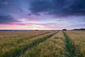
Still thinking about this concept I travelled home, not knowing what would take my eye, if anything, but it was at this point I started thinking about photographers who had much experience in scenery and shooting wildlife, luckily the two photographers i found were very helpful in showing me not only the absolute beauty of the country side, but also the lasting effects of the photographs themselves.

Adem Berton
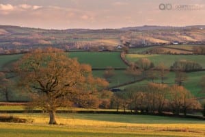
495c4f38b6ebbea324585a41f3031ace4f1be36f

Ref: http://www.adamburtonphotography.com/

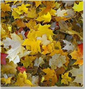
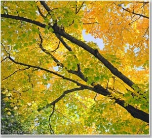
Bill Atkinson

1256_WebImage

Ref: http://www.billatkinson.com/

After viewing all these different images of multiple countryside’s I knew that i had to take a walk around Evedon (my village) and photograph what truly inspired me about my place of childhood. Since I think that a lot of our memories that are linked with home stem from our memories, which personally is very easily triggered by the smell of a newly blossomed flower or the sound of the wind rushing through the leaves of a tree.

I took roughly 30 images, I was thinking of myself of a professional when I took these, I merely wanted to gain an understanding of my ability and also the scope I was trying to capture in these images, luckily I was so surprised that my nature photography had proven successful. But this project was about the idea of ‘home’ so I then made the choice to pick the photos that mean the most to me as an individual and hope that when you read this you understand my decision

Final Images

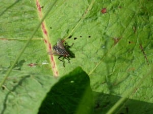
P1000522

This close up of a bug was me experimenting with many different styles of shots, this extreme close up is a reminder of the wildlife that i grew up around, it is just one element that makes the ‘home’ experience for me.

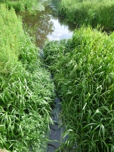
P1000533

This picture reminds me of the walk to school i had to take, its anouther part of my life and of my ‘home’ experience. I love how the water fits so perfectly still in the middle of the green.

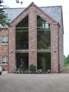
P1000467

This is my house, which i think does needed to be added just to give some context to these images, an average shot, but it still holds a special place in my memories.

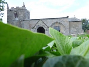
P1000503

This picture is very dilibrate, since i have never been in this church, and have always shyed away from it, therefore when i took this picture i sheilded myself using nature, which i think made for a very good image, showing the green nature against the old church yard.

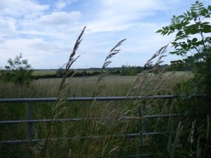
P1000483

Gates and feilds; the wheat the feilds produce, this is all just so homely to me and this is why i had to include it, i knew i wanted just a few crops in sight, just to have that nice foucs around them, making them the subject of the image.

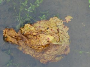
P1000537

Finally we have the autumn leaf, floating on the water in blissful silence, to me I really do imagine this leaf being more than just any old leaf, it is symbolic of my home, it’s so calm and it changes through the seasons, but it will always be there in some form, like now, i am away from home but when i return there will still be leaves and there will still be my family, and on a more morbid note, when they do pass i will still think of Evedon as home, it holds grand memories and feelings that i cannot feel anywhere else.

Home is about what we as a person define as our place, that place where we are at our calmest, we are able to put our guards down and embrace our environment and surrounding. I love how everyone can view one topic slightly different, I just see it as being very green indeed.
Portraiture

For this brief I knew that this would be the most traditional style of photography I would be dealing with, which is not a bad thing, since with the other projects I have been a little different, this one I knew that I wanted to try lots of styles but through lots of practice and research I knew that I wanted traditional portraits.

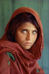
My research had to start with one of the most famous portrait photographs of all time, Afghan Girl, by Steve McCurry which is totally stunning to be gazed at, yet I think it’s more the expression that I am very interested in when it comes to inspiring me for this project. Emotion has always been a tricky subject in photographs, since telling somebody to “say cheese” seems a little redundant and fake, and never really produces a convincing photograph. Posing for photographs does have its place in the photographic world, but personally for pictures that focus on somebody’s face there should be a focus on the natural, unaltered human face. Personally I think that when a photo is taken it is to convey a message about the people in the photo or it can be styled and therefore showing the photographers abilities.

Source:http://ngm.nationalgeographic.com/2002/04/afghan-girl/index-text

His work as a whole has been very helpful in enhancing my abilities to determine how powerful one simple expressionless face can be.

Another inspiration for my final pictures came from August Sander who incorporates more of the body into his images, but the types of people he photographs and the amount of detail he puts into every single picture is why I feel so inspired, looking at his works show me that every single image has a story to it, and this is one of the reasons I love photography; every image and person in it has a story to tell.

Ref: http://www.artophilia.com/artists/august-sander/
Ref: http://onlyoldphotography.tumblr.com/post/27624298910/august-sander-member-of-a-nuremberg-student

These photos show such power in the emotions on the people’s faces, this is why my final images show emotion in there expressions, maybe not on the same serious tone, but I do like to have my own unique spin on every single picture I take.

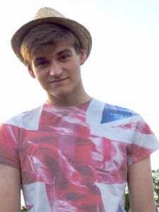
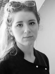
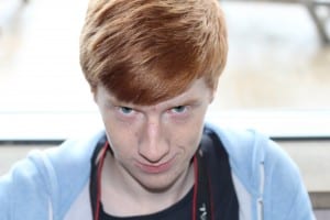
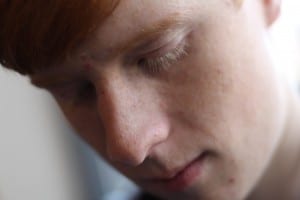
For these four photos I tried to range my abilities as a portrait photographer:

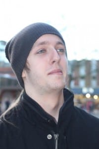
WilliamPortate

This photo of myself was a way of seeing how I personally would react to a natural picture, since i wanted to have a very neutral face in this picture, because a fake smile would never mean as much as a natural blank expression. I captured most of my chest because i think a portrait would be more than just the face, but the natural state of the body under a camera. Being in the sunny outdoors in a cool hat, it is clear from all elements that I am in a good environment and there is a warmth emitted from this picture, but I love how after all this there can still be this very static look of camera-shy awkwardness, and that is what surprise pictures are all about.

P1000601

With this image i started to play about with the idea of using a black and white filter to enhance my images, since in this photo there was a lot of natural light, which good for a normal image for this project proved to be problematic, since it was drawing to much attention away from the person in the photo. Solving this problem was easy since when the black and white filter was applied it totally changed the whole image, making it a lot more vibrant and putting all the attention onto the model. The colours are much defined so as well as solving a problem adding this filter has indeed improved this image. I decided on not having my final images in a filter is because of the limitations it gives, i like to have lots of creative freedom, when black and white colours are very constricting.

kum kum kummmm

Now this picture i took to mess about with higher angles in my photography, portraiture is very subjective, so this image to some may look a little evil, but I think this just explores how different emotions can be captured by the simple raising of an angle, it just goes to show how remarkable the human face can be, just one simple change can make a massive difference.

DAVID SEXY KUM

For this photo I wanted to have a close up of a face, more like magazine cover or a photo shoot, just to experiment with the idea and features of somebody’s face being a lot more dominate to a photograph.

Final Images

gaming

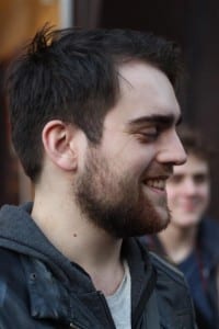
Jackman

My final images are showing true expression, this is the reason I love them so much, it is my ideal portraits, since there is real emotion shown, through smoking and smiling, you can see it on their faces, that real genuine emotion, I think this brief was a success as i tried a range of styles and techniques and my overall final images are completely honest with themselves and the viewer, which for me in integral.

The Found Object

For this project we were challenged with finding objects from a certain area and creating three images that are linked in some way, so this is when I undertook some research to find out what style I wanted to take inspiration from. However when I begun my research I found there were so many to choose from, but there were two different photographers that stood out and helped provide me with the creative ideas to produce my final images.

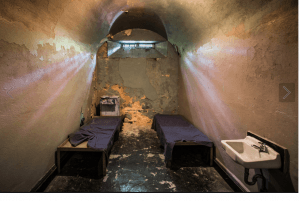
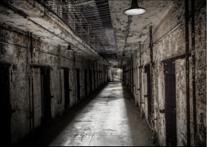
My first inspiration came from Brian Eselle who’s photography has many different styles however what really captured my attention was his shots of empty rooms.
With the photography being of the entire room, every small element whether it be a lamp or the position of the bed has a certain significance and considering the brief has stated that our found objects should be found in certain locations I found his work appropriate and helpful.
These images titled ‘Prison View’ and ‘Road to Death row’ is a perfect example of how an entire landscape in these incidences a whole room is needed in order to reach the desired impact on the audience especially for such a dark topic.

Ref: https://500px.com/brianestelle

As we can see his images are very dark when it comes to tone and lighting which creates atmosphere in his work, it was at this time that i knew what I wanted to shoot my found objects in their natural enviroment and in order to have a ‘natural’ effect.
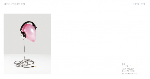
But I knew for this project I would have to focus on a smaller number of objects in my photos, which is why I feel entranced with the works of Jenny Van Sommers who focus on still life and object photography, and while i think her work is incredible , I focused on a few images to analyse and take influence from, like this first peice called ‘Big’ which shows the relation and reliance on all the objects in the picture and the recreation between them in order to have a deserved effect on the viewer.

Ref: http://www.jennyvansommers.com/editorial/big/

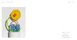
Her pictures had a huge influence on this project for me, the style of her photographs really influenced me, since they are quite outlandish in structure, they combined opposing objects to make the final image bizarre but that is why it is so powerful to view. Her other works are just as powerful, but German Vogue shows how multiple objects can be arranged to make a secular image in a neutral background.

Ref: http://www.jennyvansommers.com/

It was the combination of these two photographers that made my final images what they were, since Eselle focused on design of the background and being in the scene, which is why my final images are not shown in a controlled room, they are take in there natural environment. The influence of Sommers was much more focused on the foreground of the picture, the ensemble of objects together that I found complimented the surroundings to make the final images compelling.

Honestly I think that taking these objects from there original environment detracts impact from the photos, especially since our given location was industry, I wanted to capture to the mundane dirty gritty realism of industry in my pictures, and putting them up in a posh white background and showering them with studio lights would detract from the message I want to convey as a photographer.

Final Images

IMG_2766

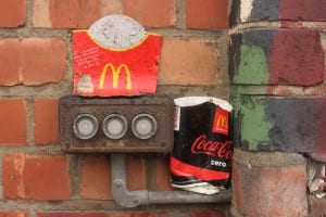
With this photo I wanted to show the relationship between industry and the products of the industry, the fast food waste placed on the dirty rusty industry equipment makes for a very powerful image since they both have dirt on them, showing there connection, but the bright vibrant reds are despratly trying to show a more bright view of the industry.

Found image

The sign compilation was to show the industrial grit of the surroundings and to bring realism into the collection of images, where as the group of objects on each other represent the abstract nature of the objects that can be found on the ground, where the final image is a combination of the two and has the industrial dirt combined with the industry in the form of a McDonald waste. My images are showing how industry is always dirty but it can be beautiful in the waste it creates.

IMG_2735

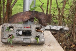
This photo is a collection of objects found near the factories, I arranged them to create a mixture of natural and manmade objects, man and nature have mixed with the development of industry, but I thought I could combined them to create this image of beauty, I call it “metal environment” because it is arranged like a collection of nature, but in reality it is about how industry can be beautiful .

References: www.jennyvansommers.com, https://500px.com/brianestelle

Appropriation

This brief was very interesting to me, because until i was given this project I always thought stealing was bad, but now I can see that there is so much more to altering a image to create a different image with different meanings. When I started research on this project I thought about where have I seen the most image recreation and altering of pictures to have new meanings. The internet is full of many wild sites which allow you to alter images to create a joke or message, most commonly known as a ‘meme’. The internet have millions of these sites which allow the user to create or view these images with a click of a button, websites such as:
– https://imgflip.com/memegenerator
– http://imgur.com/
– http://www.memes.com/

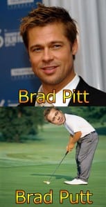
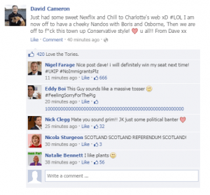
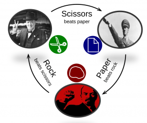
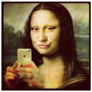
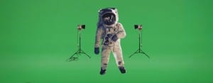
So once I found these sorts of images, I decided to have a go and to create my own parody images, in order to create laughter from such images that would usually be taken seriously. This was just at an armature level, the time and effort can be seen in the pictures, since they were designed to have a quick laugh and then nothing more, there are no deeper meanings to these images other then there face values.

Brad Pitt

Simple Perfection

Rock Paper Scissors

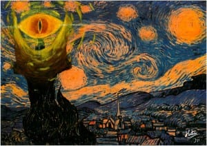
When these were showed in class there was laughter, but that is the moment I knew that these images I created were of a very low quality in regards to this project. I then continued to think in order to revitalise my idea, so i went around the web searching for a method of recreating a image or object to a higher quality, this brought me to these images, both of which set on recreating famous art pieces in order to make pop culture references on today’s society.

photo

starry_night_appropriation_by_jhodiny-d52ckrt

After this research on appropriation I had a much better view of this topic as a whole, since I viewed appropriation from both a professional and armatures standpoint. To gain an even better understanding i decided to look at some work that was at such a professional standard that I was imminently drawn to it and it gave me a wider view of this subject. The work shown is of Salvador Dalí, more specifically this piece titled ‘Lobster Telephone’

Ref: http://www.tate.org.uk/art/artworks/dali-lobster-telephone-t03257

I see this piece as being comedic but also can be seen as a artistic view of using two objects out of place to make one new image with new meanings. This notion of being able to make something incredible out of already defined images defiantly influenced my final images, since when I decided to create my own images they consisted of taking a image and placing it in a environment which would create new meaning to the overall image.

Final Images

Imagetwo

Image1

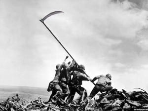
scythe

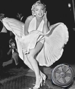
My final images did turn out successful, i mean they were not as great as i would like, but honestly i am no Photoshop wizard, so i had to keep my ideas simple, so i thought, what could be more simple then recreating images that people already had a strong connection to, therefore changing them in any fashion would have a big impact on the viewer. My images were displaying that when we look at a famous image we automatically associate it with a famous event in history, so one simple change to this picture can totally contextualise it.

In conclusion to this project I have learnt so much about this practice of art, and how it can come in many different forms, how you can use somebody’s image in order to create a different image which overall makes something totally different , which can be appreciated on a different level. From knowing nothing about this subject to then having a wide range of knowledge, i would say i have developed my knowledge of the photographic world and industry.

Hello world!

Hello Lincoln blogs! I guess this will be the introduction to me and to give some context to my ideas and photos. I am William Bush and I have loved photography since I can remember having my first £20 digital camera, it is the notion of capturing that one perfect moment in time and then having it forever to remember. Photos carry so many connotations and meanings to different people and that’s why I love taking them everywhere I go. I took Media Production because I knew it was what I want to do for the rest of my life. All of my pieces will be experimental since this is first year, and I am not a photo master (sadly) but rest assure there was so much effort going into each picture, trying to expand my knowledge and understanding of the photographic world….enjoy!

UoL-logo-general-use-white-background